OVERVIEW
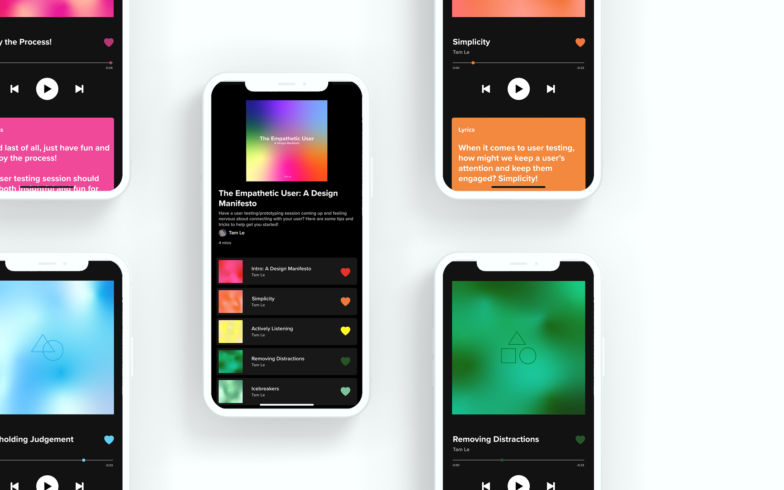
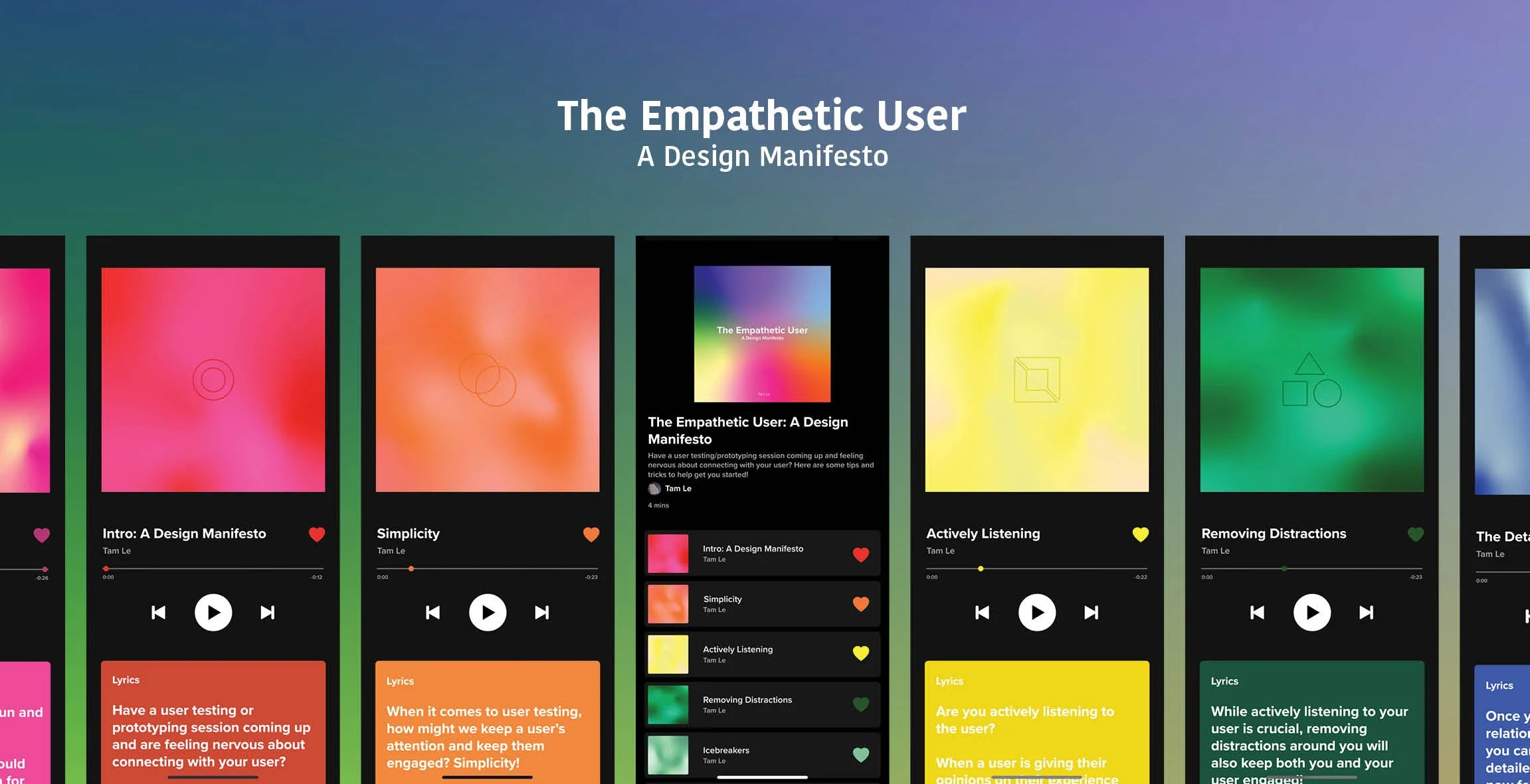
The Empathetic User Manifesto is a collection of user testing tips presented in the form of a Spotify playlist designed in Adobe Xd. This design not only demonstrates my skills with Spotify’s interface but
also highlights my passion for user testing.
The Empathetic User: A Design Manifesto
TOOLS
Adobe Xd, Illustrator, Photoshop, InDesign
or view below ↓
PROTOTYPE
The brief required the design of a manifesto that reflects my personal standpoint as a designer, one that I could leave behind which represents who I am as a designer.
THE BRIEF
The outcome was a collection of user testing tips presented in the form of a Spotify playlist designed in Adobe Xd. This design not only demonstrates my skills with Spotify’s interface but also highlights my passion for user testing. The deliverable included a functional prototype of the design.
THE OUTCOME
I approached this brief by reflecting on my experiences as a student designer and my passion for the field I aspire to work in, UI/UX design. The inspiration came from my desire to demonstrate my interest in user testing and incorporate it into a digital format.
THE SPARK
PROCESS WORK
INITIAL IDEATION
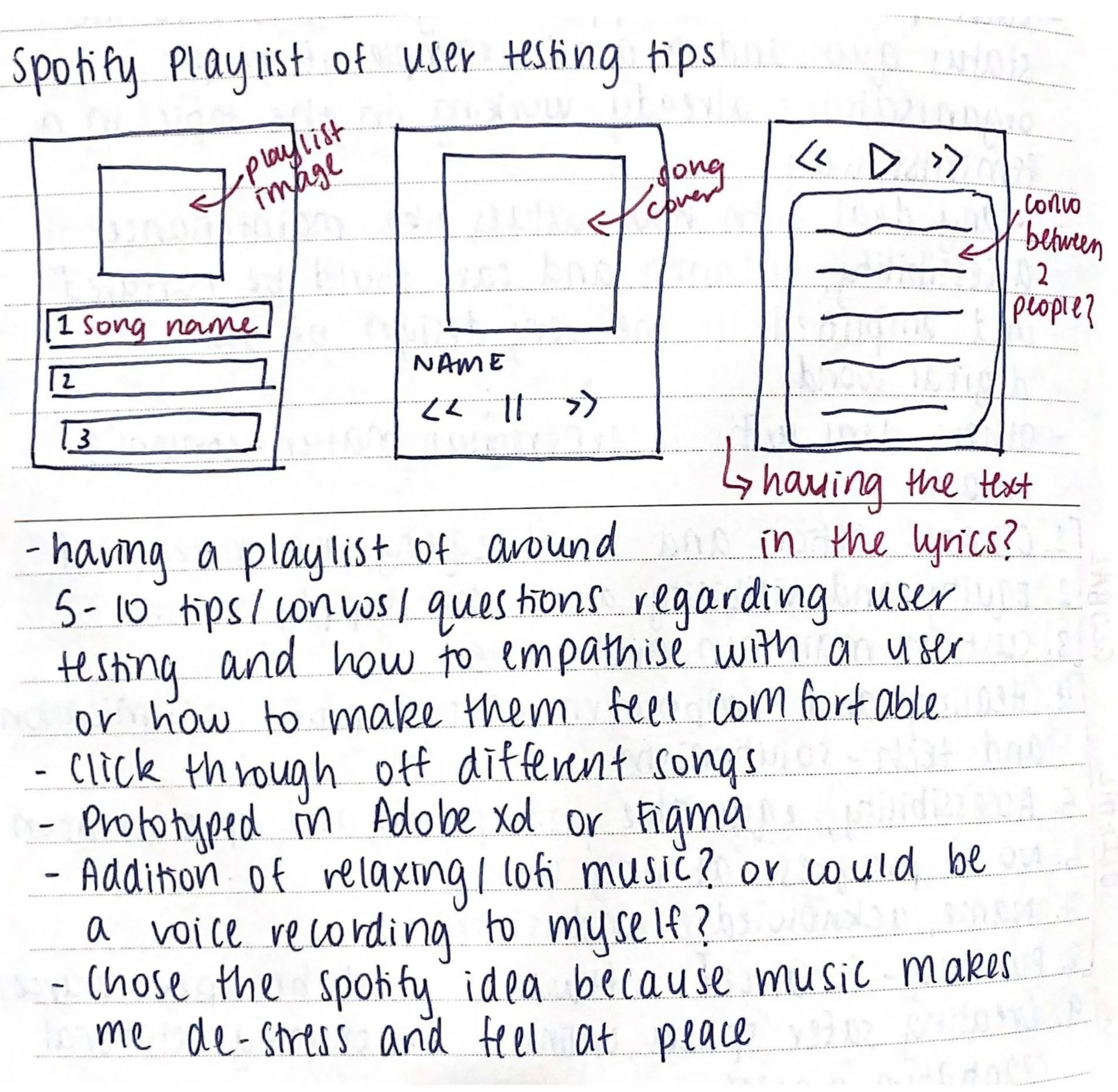
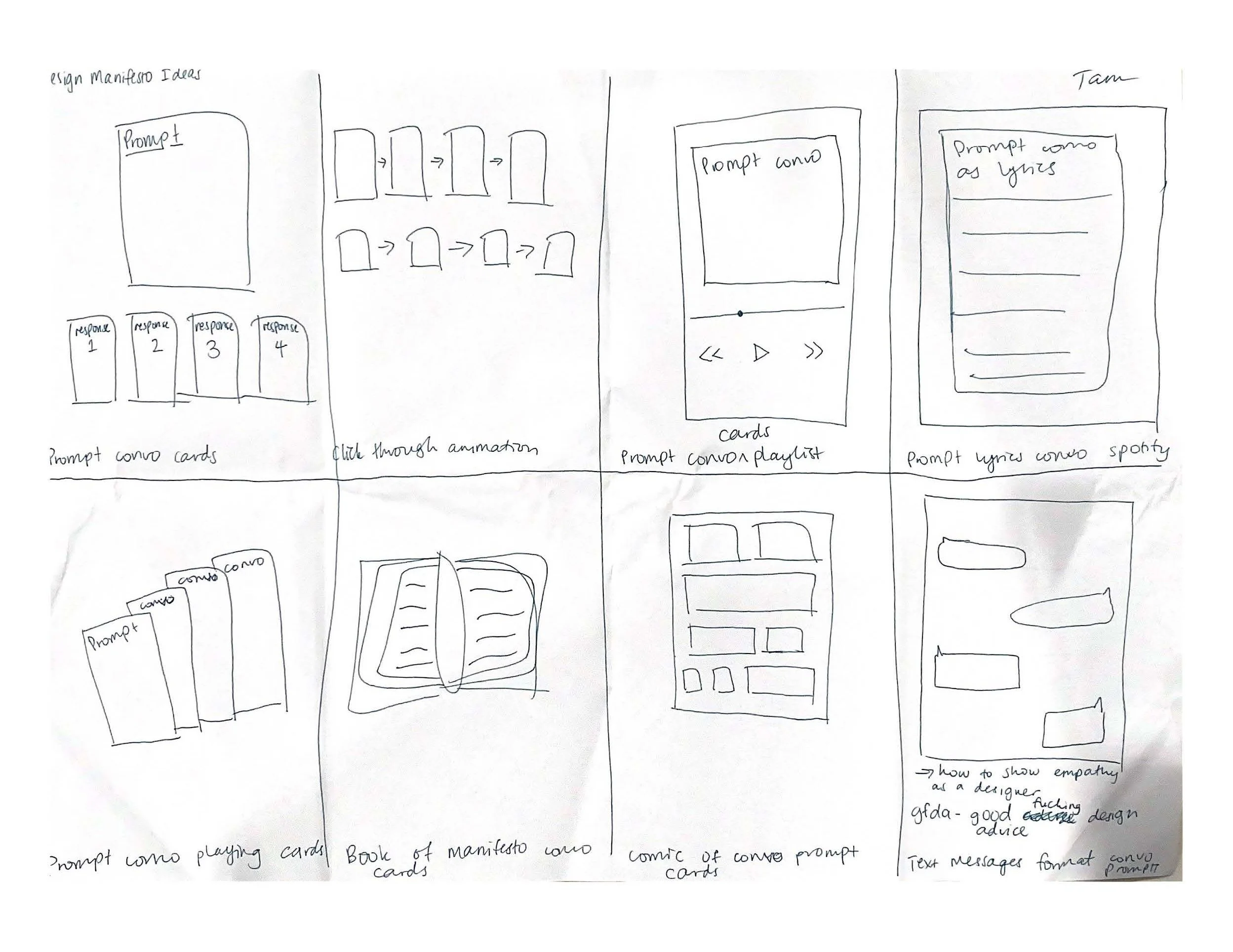
The manifesto consists of 5-10 tips focused on user testing and empathizing with users to create comfort. Intended for UX designers before a user testing session, the playlist serves as a relaxing and informative tool, providing tips for engagement in user testing.
USER SURVEY
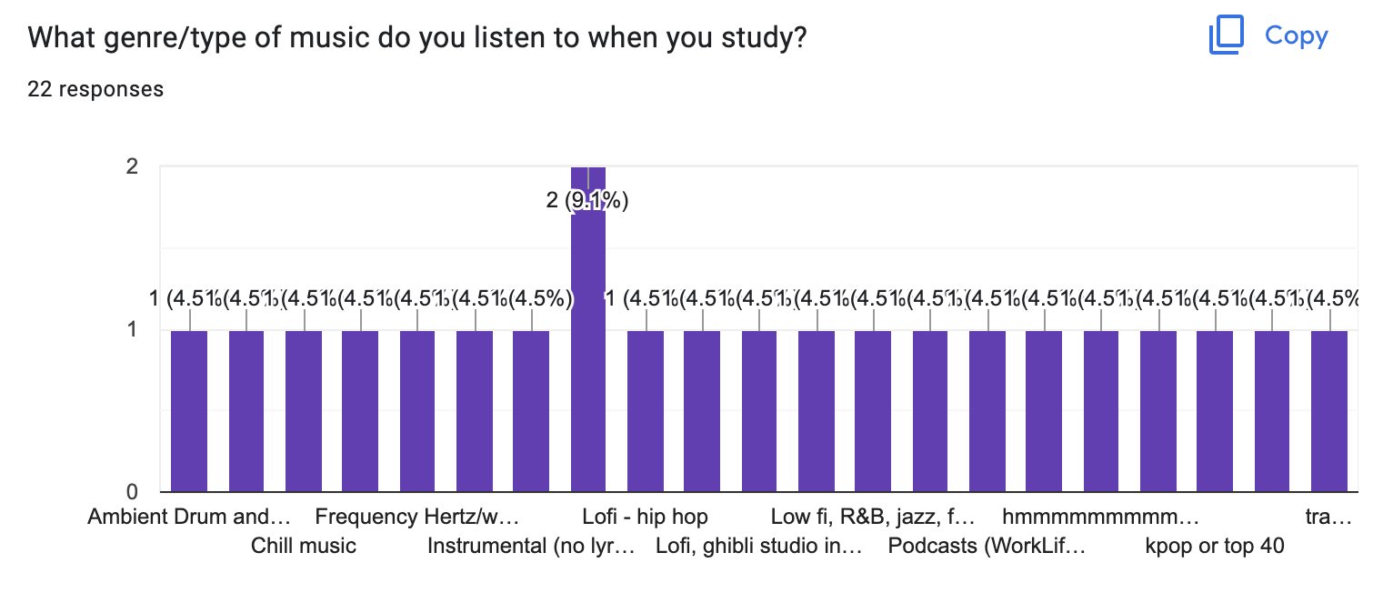
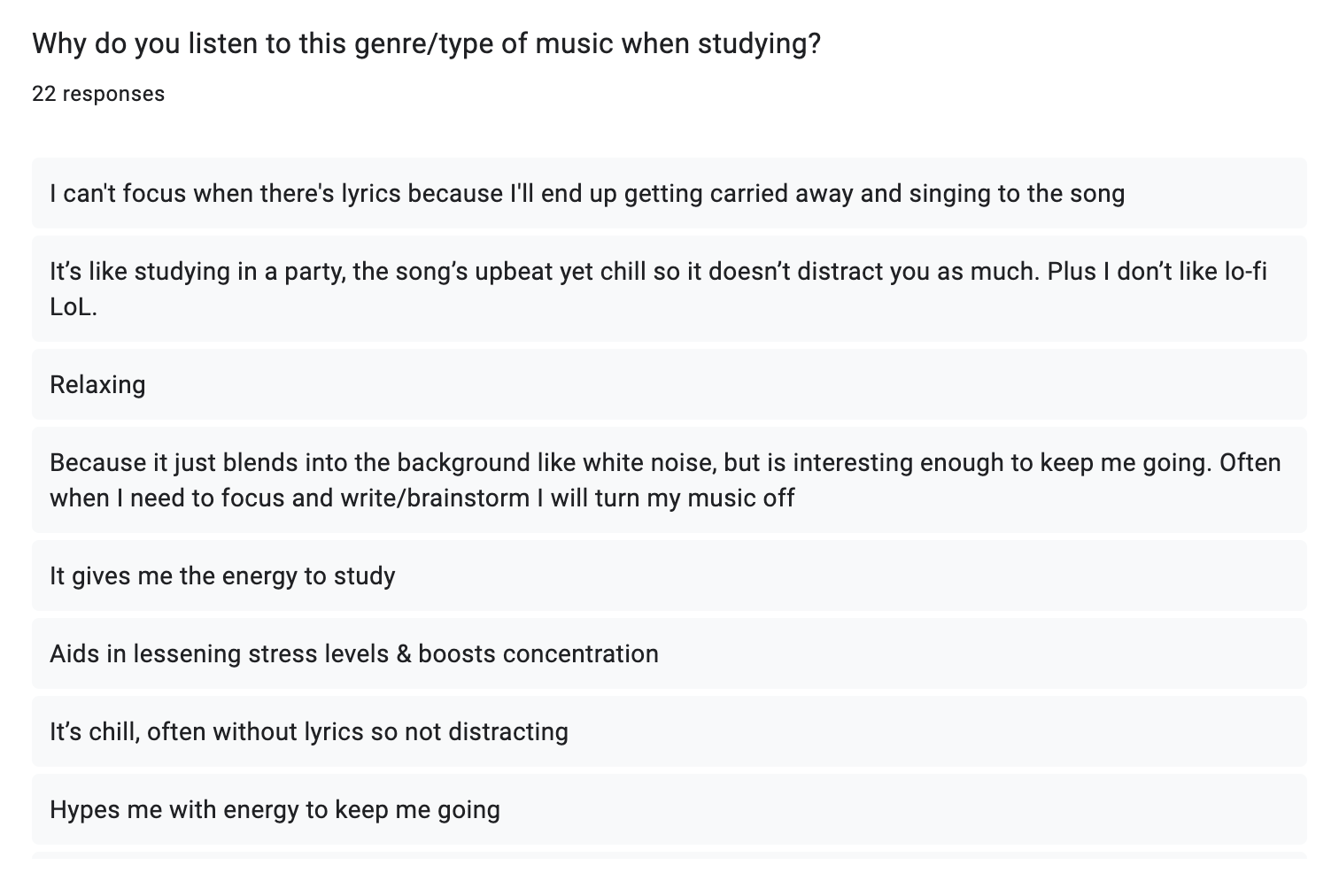
A survey was conducted to gather insights on the type of music people prefer when studying. I chose this route because studying often calls for music that induces relaxation and reduces stress, mirroring the atmosphere I aim to create with my manifesto.
The survey revealed that most individuals prefer lofi music and instrumentals without lyrics to help them focus and relax. As a result, I opted to use relaxing instrumental music in the manifesto to create a soothing and calming experience for the audience.
SCREEN & COVER DESIGN
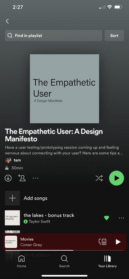
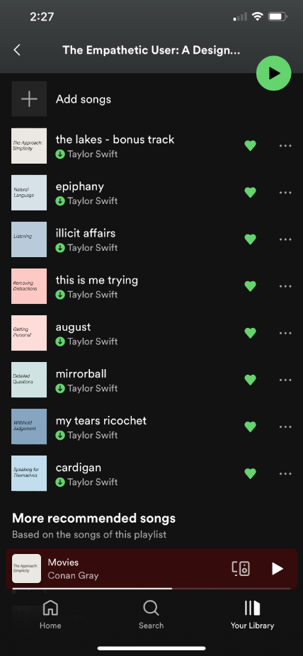
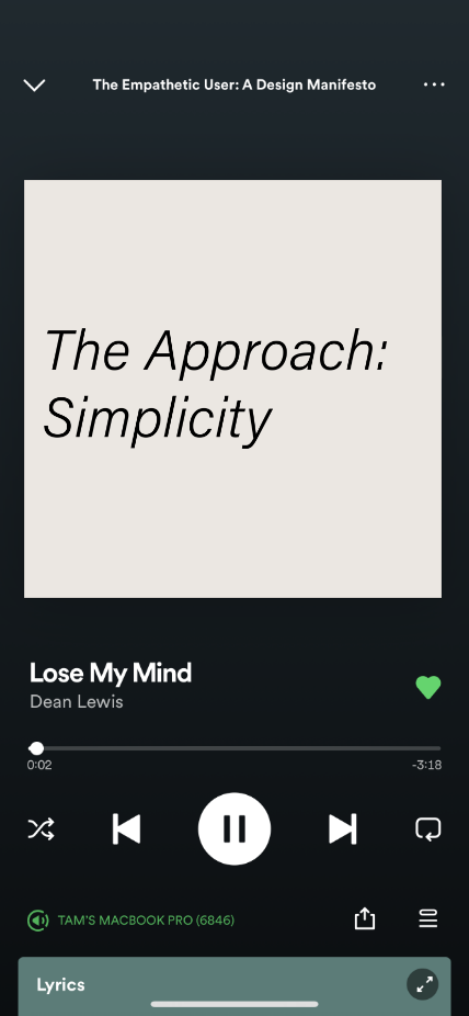
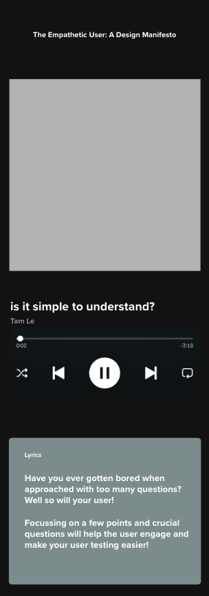
The screens underwent multiple drafts using Spotify’s existing UI, incorporating the content onto existing Spotify screens in Adobe Xd.
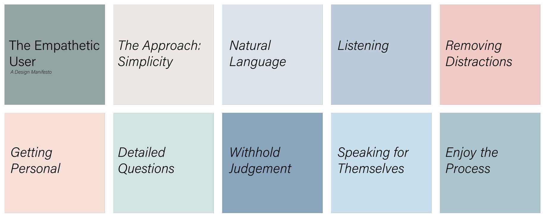
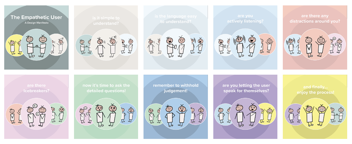
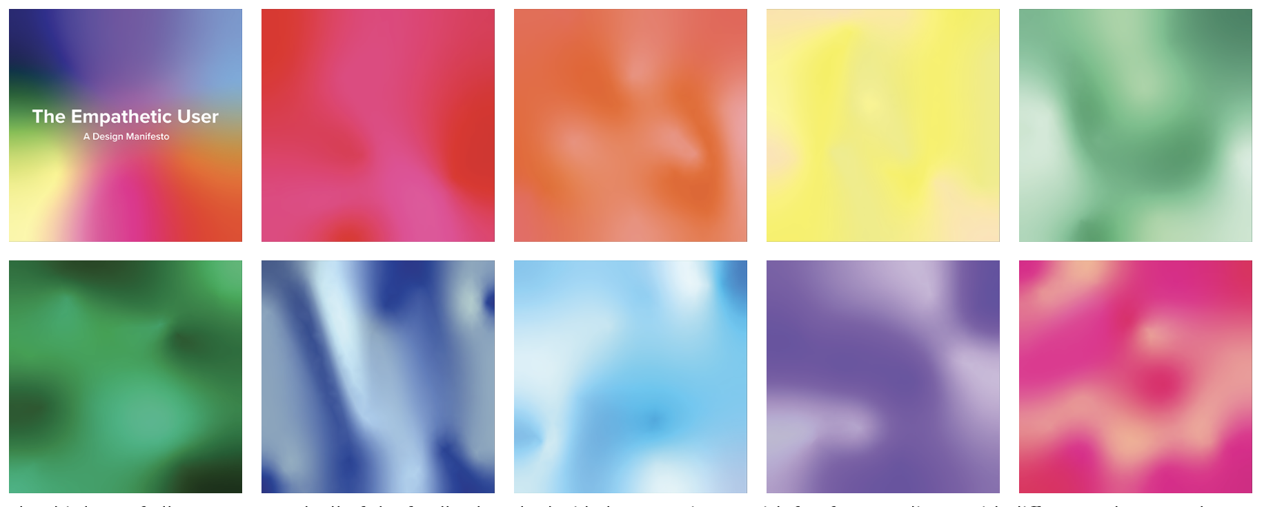
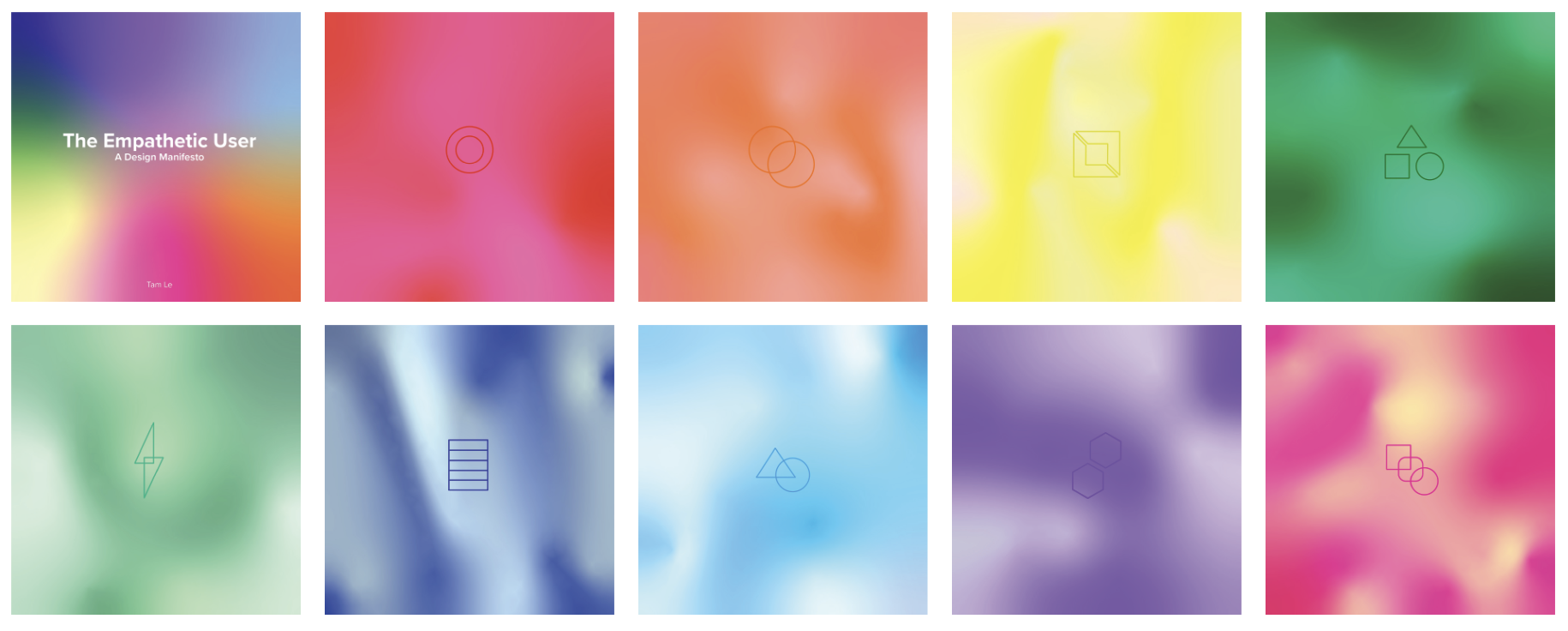
Different artworks were designed to co-exist within Spotify’s existing userface. For the art I wanted it to encapsulate Spotify’s existing UI but also make it my own which started off more literal but then went into more symbolism and abstraction which to me felt much more free flowing and comfortable. The end resulted in a rainbow colour scheme, one colour representing each step of the process.
MOCK-UPS